Customizing the appearance of a form
If the form is already published, its design changes.
Theme
You can give your form a distinct look by customizing the appearance of the text and buttons or adding a background image:
-
Select the form and open the Theme tab.
-
Pick one of the available themes or create your own by clicking Create custom theme:
-
Set a background for the form workspace: choose a fill color or an image from the gallery, or upload your own background. You can set the background opacity, corner rounding, width, and padding.
-
Select the backdrop: the background around the form workspace. To do so, enable Card background
 and select a fill color, pick an image from the gallery, or upload your own background. The backdrop is visible if you publish the form via a link.
 -
Configure the colors of various form elements.
-
Customize the appearance of form fields by adjusting their size, corner rounding, and padding.
-
To view all theme settings, click Show additional settings. To hide them, click Hide additional settings.
-
Click Save.
-
The new theme will appear in the list of available themes. To modify it, click Edit.
Requirements for custom background images
When uploading a custom background or backdrop for a form, keep in mind the following limitations:
- Image resolution: No limits. You can upload an image of any width and height.
- File size: Up to 30 MB.
- File format: For large files, we recommend using the JPG format. Other formats, such as PNG, may result in longer processing times.
Uploaded images are automatically resized and converted to the optimal format to ensure they display correctly in the form.
Additional theme settings
Additional settings can be helpful if you need more customization:
-
Adjust the padding between the question text and the input field.
-
Set the size of the asterisk * indicating required questions or disable it.
-
Configure the size, shape, and position of the submit button.
-
Select fonts and their weight for texts in the form.
-
Click Save.
Button names and submission message
You can set form button names and the message that the user sees after submitting their response:
-
Select a form and go to Settings → Text and submit logic.
-
Change the button names under:
- Form submission button.
- Buttons for navigating through form pages.
-
Under Event after submit, change the heading and comment.
For more information about customizing the event, see Customizing the results page. -
Click Save.
Formatting text
You can use formatting (such as headings, lists, links, or italics) in your questions and comments, as well as in the success message that users see when they submit a form.
To do this, use the basic Markdown markup.
Unlike Yandex Tracker and Wiki, Forms doesn't support the advanced formatting features from Yandex Flavored Markdown, such as changing the text color.
If a line or word starts with a special character used for text markup in Markdown — such as *, -, or > — that character changes the appearance of the text but isn't visible to the user. To make these characters visible, precede them with a backslash. For example, \*question*.
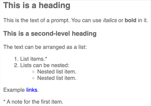
Sample markup
## This is a heading

This is the question text. You can use *italics* or **bold** in it.

### This is a second-level heading

The text can be arranged as a list:
1. List items.*
1. Lists can be nested:
    * Nested list item.
    * Nested list item.

Example [links](https://yandex.ru).

\* A note for the first item.
Result