Design recommendations
A plugin is part of the Tracker interface
A plugin integrates into existing Tracker scenarios, such as the issue page, automations, extension lists, actions, and other entry points. That's why a plugin interface should feel like a natural extension of the product rather than a separate app within it. The basis of a plugin interface is a standard container with content inside.
The user shouldn't have to figure out all over again:
-
Where they are.
-
How navigation works.
-
What the primary action is.
-
How to close the scenario or go back.
Plugin design recommendations
-
Use the spacing system with a 4 px increment. The most common values: 12, 16, 20, 24, 32 px.
-
Inside the plugin, focus on a single clear scenario.
-
Use one primary action button, with all other buttons set to normal or flat. The recommended button size is 28 to 36 px.
-
Avoid nested navigation if the scenario can be resolved within a single screen.
-
Keep the interface free of unnecessary visual noise.
-
The block height should be justified by the scenario.
-
Use the
yandex-360color scheme from the Gravity UI design system. -
Maintain a clear heading hierarchy, from largest to smallest. We recommend using no more than three levels.
Recommended components for use
Developers can use any Gravity UI components. Below are the recommended components that are most commonly used for plugin interfaces in Tracker.
Button
Button component: Used as a trigger to perform an action. Its main purpose is to launch a scenario: saving, confirming, or starting a plugin.
Design recommendations
Storybook
Text Input (single-line field)
TextInput component: Used to enter short text, numbers, or single-line values.
Design recommendations
Storybook
TextArea (multi-line field)
TextArea component: Used to enter long text and descriptions.
Design recommendations
Storybook
Select (single and multiple choice)
Select component: Used to choose one or more values from a list.
Supports:
-
Single choice.
-
Multiple choice.
-
Grouping (categories).
Design recommendations
Storybook
Examples (showcase)
Checkbox
Checkbox component: Used to select one or more independent options.
Design recommendations
Storybook
Tooltip
Tooltip component: Used for brief explanations and hints on hover.
Design recommendations
Storybook
Progress (Progress Bar)
Progress component: Used to show the progress of an operation, such as a file upload.
Design recommendations
Storybook
SegmentedRadioGroup (Segment control)
SegmentedRadioGroup component: Used to select one of several mutually exclusive options, usually 2–3.
File Upload (FileDropzone)
FileDropzone component: Used for uploading files via drag & drop or file selection.
Markdown Editor (input field with an editor)
MarkdownEditor component: Used for entering and editing formatted text. It supports both the visual mode (WYSIWYG) and working with Markdown markup. This allows you to easily write text and control the content structure at the same time.
Used for:
-
Descriptions.
-
Comments.
-
Formatted user content.
-
Text generation in plugins.
Features:
-
Markdown and YFM support.
-
Two modes: visual and markup.
-
Extensibility, e.g., tables, code, and diagrams.
Design recommendations
- Use only when formatted text is actually needed.
- Don't use it instead of a regular TextArea.
Table
Used to display tabular data and plugin operation results.
Suitable for:
-
Reports.
-
Lists of entities.
-
Analytics.
-
Action results.
Entity suggests
Used for:
-
Selecting projects.
-
Selecting issues.
-
Selecting users.
-
Selecting queues.
-
Selecting fields.
Interface states
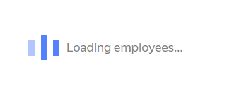
Loading: Show that data is loading. Use Loader.
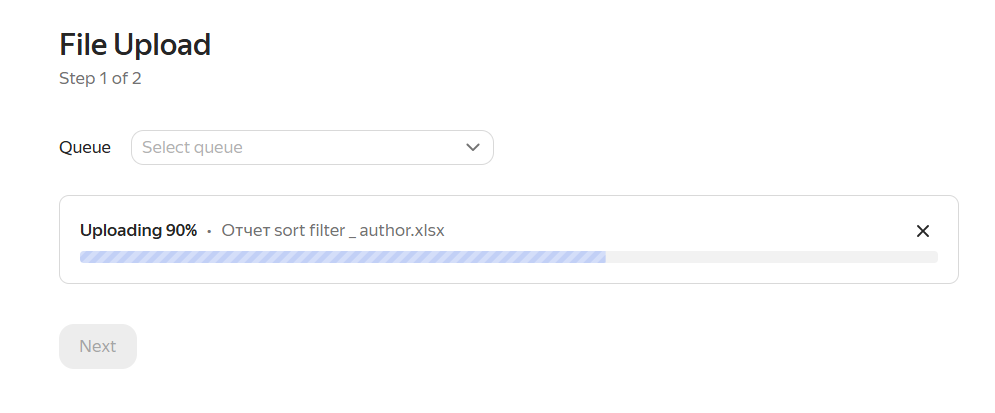
If the process takes a long time, use the Progress component.
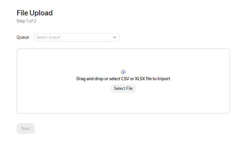
Empty: A typical empty state that explains what to do. We recommend using interface elements. It's important to explain to the user what to do next: connect, select, upload, or configure.
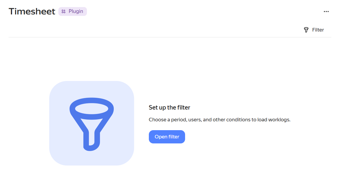
You can also use illustrations from the Placeholder Container component.
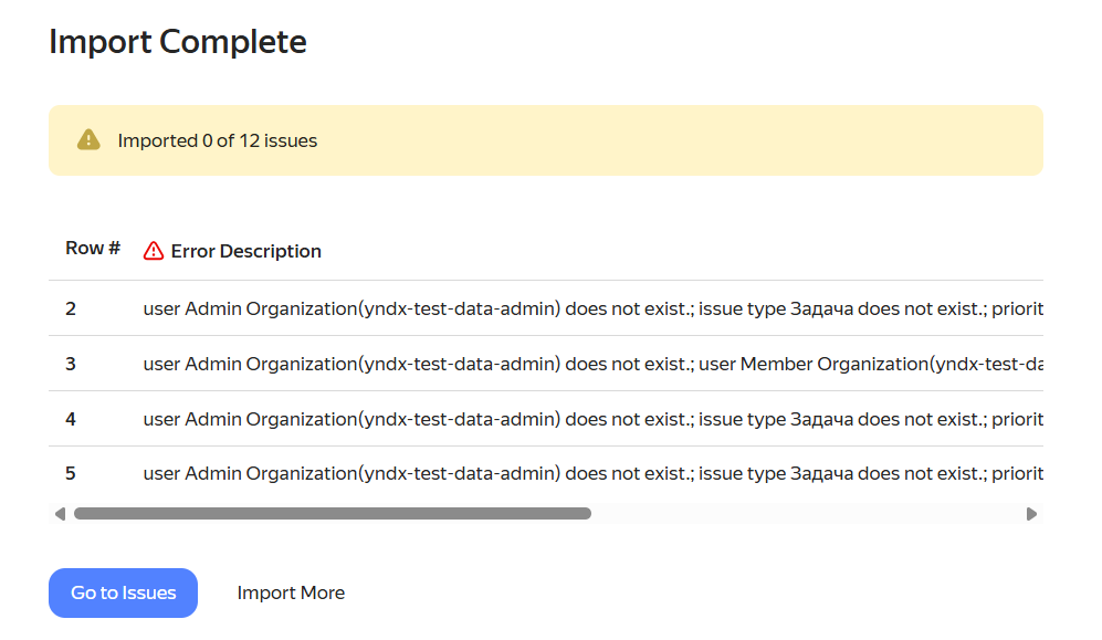
Error: Show the problem and provide an action. Use the Alert component. You can also use it for successful completion.
You can display messages and errors as a pop-up using the Toast component. This is perfect for brief notifications when you don't need a separate block. To enable it, use the API.
Pre-publish plugin checklist
- The plugin has a clear title or name.
- The correct embedding method is selected.
- There's a single clear scenario.
- There's one primary button, with the rest set to normal or flat.
- Gravity components are used.
- The loading, empty, and error states are accounted for.
- Alert or Toast components are used when needed.
- The interface isn't overloaded.
- The height is justified by the scenario.
- The plugin looks native.