Cycle time widget
The widget shows how long it takes issues to go from the start of work to completion. It helps you see at which stages issues get delayed and whether the team is meeting deadlines.
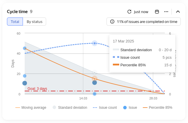
Example chart
How to read the chart
The horizontal axis shows the time period with the increment you selected in the settings.
Main lines on the chart:
- Percentile — shows how long it takes to complete a selected share of issues. For example, if the 90th percentile is 5 days, it means 90% of issues are completed in 5 days or less, and the remaining 10% take longer.
- Number of issues — shows how many issues were in progress at each step of the chart.
You can add additional indicators in the settings:
- Moving average — a smoothed line of the average cycle time across all issues.
- Goal — the target time for completing issues.
- Standard deviation — the spread of cycle time. The narrower the band, the more consistently the team completes issues.
To compare different groups of issues on the same chart, add several percentile values. For example, this lets you see how much the longest-running issues differ from the bulk of the sample.
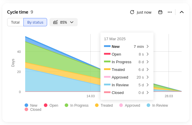
Seeing which stage delays issues
To find out which stages take the most time, switch to the By status tab.
Each colored layer on the chart represents a single status. The thicker the layer, the more time issues spent in that status.
Example diagram
Widget actions
To view the issue list, click the blue dot on the chart. To open the list in a new tab, click .

If you have Edit access to the dashboard, you can change the chart period directly on the widget: click at the top and change the settings.

To view the counters, click in the top-right corner of the widget. You'll see:
- the percentage of issues completed faster than the target time;
- the average cycle time for all issues;
- the average cycle time for each selected percentile.
The line under the counter name shows its relative value.

To display only one line on the chart, click its name at the bottom.

To remove a status from the chart, hold down Ctrl on Windows or Command on macOS and click the status name at the bottom.

To enlarge a chart area, select it with your mouse.
To return to the original scale, click Reset zoom on the right.

Widget settings

Example settings
Issues on the chart
-
Data source — the issue search conditions for the widget. You can specify them in different formats:
- Filter — here you can select a quick filter, such as "Reported by me", or your saved filter. How to save an issue filter
- Query language — here you can enter a condition in query format. Choose this if you need to insert a function or combine several conditions with the "AND" and "OR" operators. How to set a condition using the query language
- Parameters — here you can set up a condition using buttons. How to add search conditions
-
Initial statuses — the statuses at which time tracking starts.
-
Final statuses — the statuses at which time tracking ends.
-
Exclude statuses — statuses whose time isn't counted.
-
Automatic update — enable this option for the widget to update on its own. The update frequency depends on the selected time interval within the period.
Chart parameters
-
Period — the time span for the entire chart. To make the start date shift every day, select a dynamic range, such as "Last year".
Data source — the issue search conditions for the widget. You can specify them in different formats:
-
Time intervals — the step along the time axis. You can choose days, weeks, months, or sprints.
-
Working hours — the hours worked during the day. Lets you exclude nights, weekends, and holidays.
-
Percentile — a line on the chart that helps you track what share of issues are completed faster or slower.
For example, if the 90th percentile of issue completion time is 5 days, it means 90% of issues are completed in 5 days or less, and only 10% take longer. -
Show goal — enable this option and enter a value in working days to add a line with the target time for completing issues.
-
Moving average — enable this option to add a line showing the average completion time. The chart is smoothed for clarity.
-
Standard deviation — enable this option to add a band showing the spread of issue completion time.
A narrow band means the team works consistently; a wide band means completion time varies significantly. -
Display issues — enable this option to show issues and links to them on the chart for quick navigation.