Flow widget
The widget shows how the number of issues in different statuses changes over time. It helps you understand at which stages work on issues is being delayed.
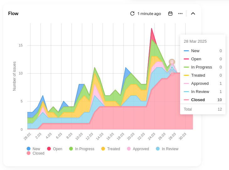
Example chart
How to read the chart
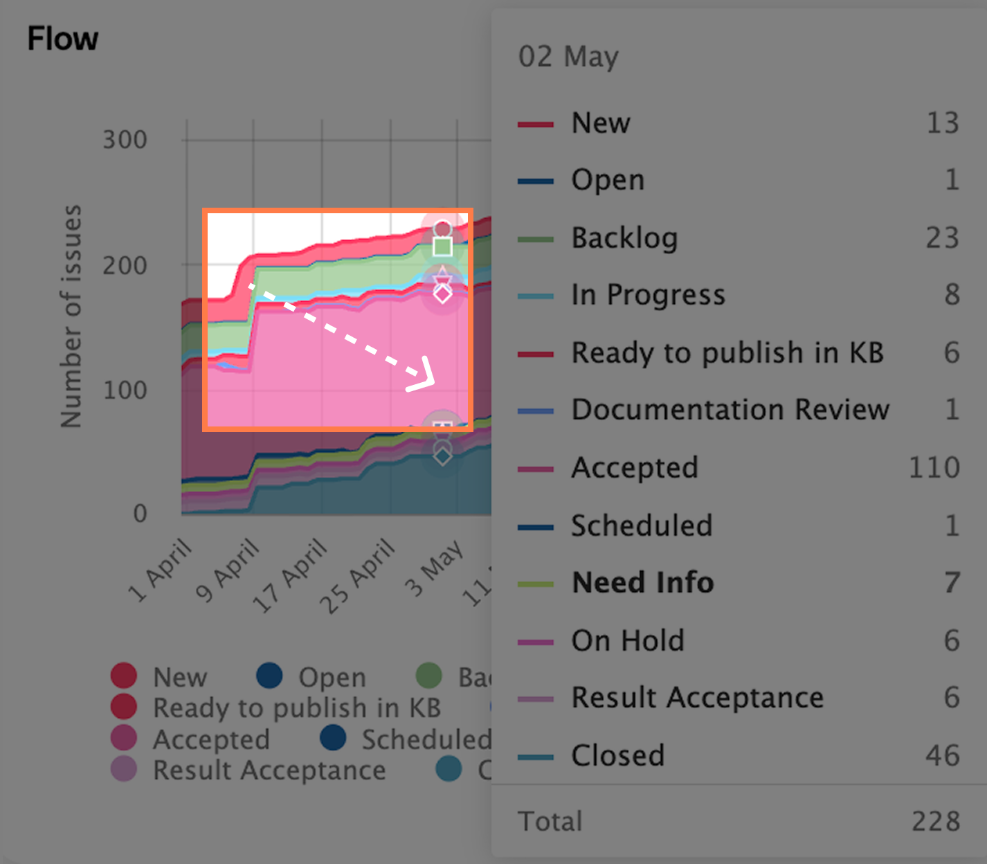
Each colored layer on the chart represents one status. The thicker the layer, the more issues are in that status.
- If the line resembles a peak, the number of issues changed dramatically.
- If one layer expands significantly, issues are being delayed at that stage.
- If several lines become horizontal at once, the team wasn't working during that time. If only one line becomes horizontal, there's a problem at that stage.
- If the chart shape repeats from period to period, work is stable and predictable.
Widget actions
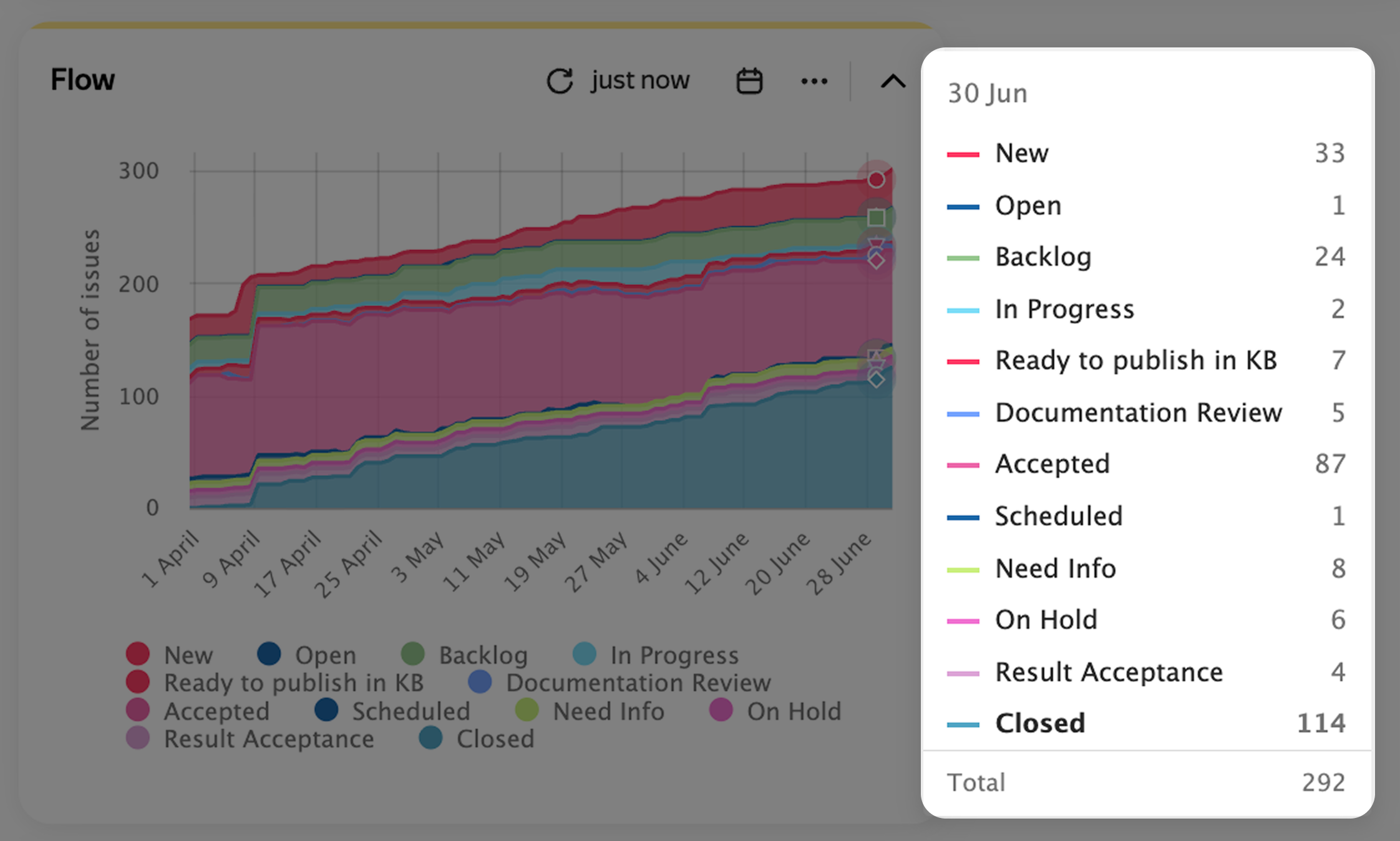
To view the list of issues at a specific point on the chart, click the point, then click the status in the drop-down list.
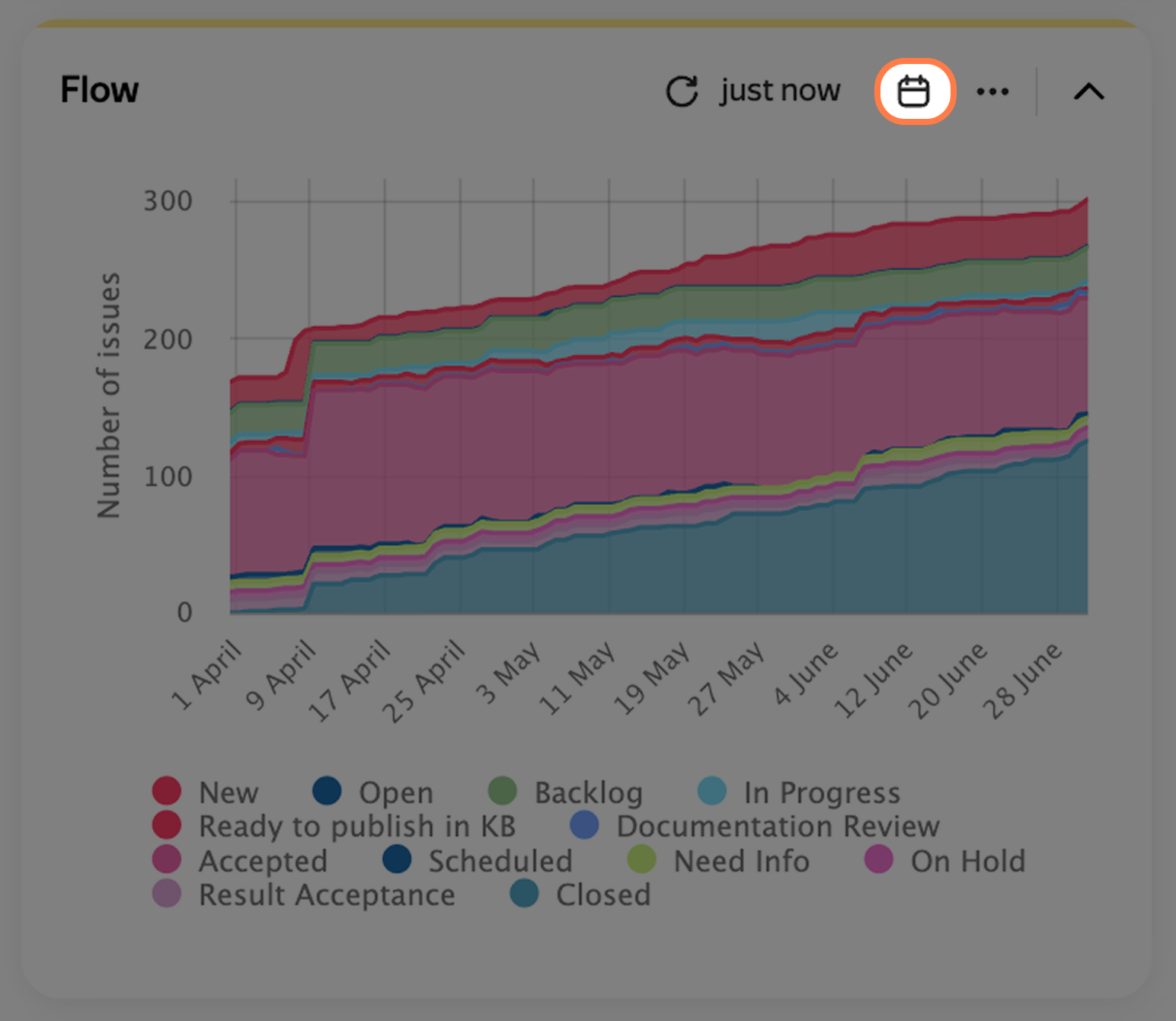
If you have Edit access to the dashboard, you can change the chart period directly on the widget: click at the top and change the settings.
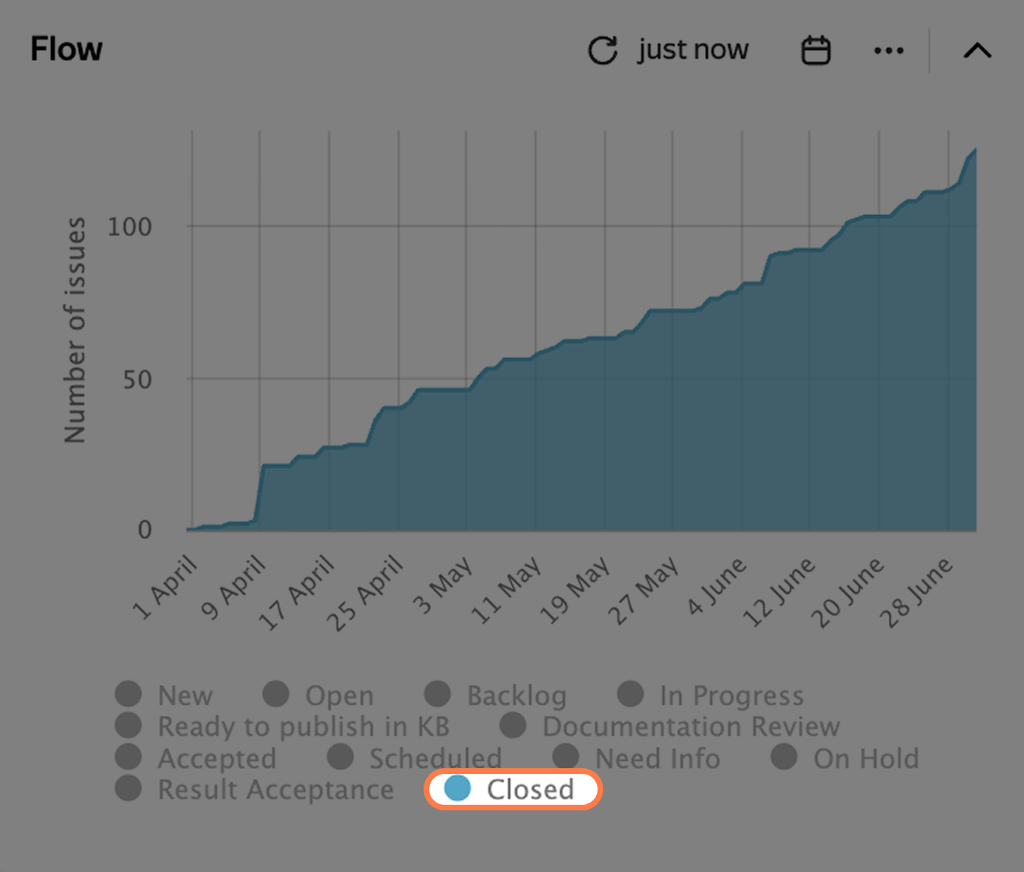
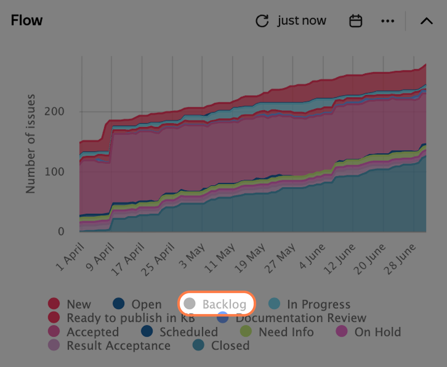
To display only one status on the chart, click its name at the bottom.
To remove a status from the chart, hold down Ctrl on Windows or Command on macOS and click the status name at the bottom.
To enlarge a chart area, select it with your mouse.
To return to the original scale, click Reset zoom on the right.
Widget settings
Example settings
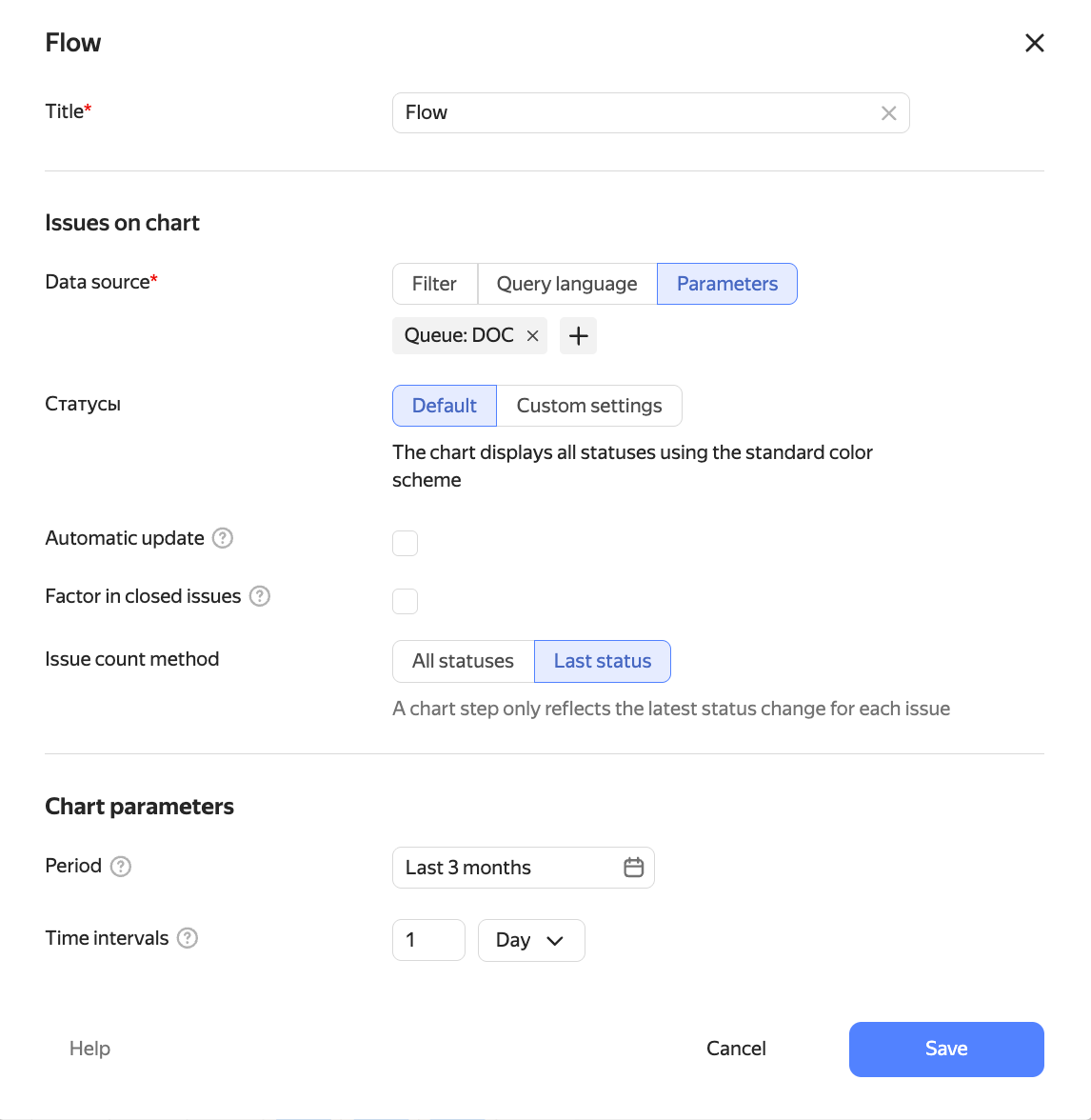
Issues on the chart
-
Data source — the issue search conditions for the widget. You can specify them in different formats:
- Filter — here you can select a quick filter, such as "Reported by me", or your saved filter. How to save an issue filter
- Query language — here you can enter a condition in query format. Choose this if you need to insert a function or combine several conditions with the "AND" and "OR" operators. How to set a condition using the query language
- Parameters — here you can set up a condition using buttons. How to add search conditions
-
Statuses — how the colored layers will be arranged.
DefaultCustom settingsOpening statuses at the top, closing statuses at the bottom, with intermediate work stages in between.
Configure your own order and colors for statuses.
- To add a new status to the chart, click Add status.
- To change a status position, drag it by the icon.
- To change a status color, click the current color and select a new one from the palette.
-
Automatic update — enable this option for the widget to update on its own. The update frequency depends on the selected time interval within the period.
-
Factor in closed issues — enable this option to see issues on the chart that were completed before the selected period started.
-
Issue count method — choose an option:
- All statuses — all status changes for each issue will be counted at one chart step.
- Last status — only the last status change for each issue will be counted at one chart step.
Chart parameters
-
Period — the time span for the entire chart. To make the start date shift every day, select a dynamic range, such as "Last year".
Data source — the issue search conditions for the widget. You can specify them in different formats:
-
Time intervals — time step along the period axis. You can choose days, weeks, months, or sprints.