Widgets
Place info blocks with personalized offers and discounts or tell users about new features.
Select an appropriate info block format and customize it to suit your needs. When creating an experiment, use the Experiment testing window to preview how the widget will appear on your site.
Add a link to redirect users to the desired page.
Examples
-
Redirecting users to a page with a new collection.
-
Redirecting users to their cart with a discount applied.
To do this, your site must have a discount system and support promo codes as link parameters.
Experiment type
Select Widgets.
Setting up page variants
You can set up the following widget types:
Note
Available only for Standard and Extended plans.
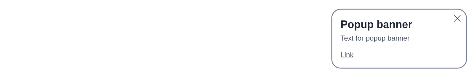
A small window in the corner of the page. It doesn't obstruct the main content and is suitable for any website layout.
Example of a corner banner
-
If you want to test several variants of text or design, click Add variant. This will add another variant for you to set up within your experiment. The variants will change during the experiment.
-
For each variant, select a widget type from the drop-down list.
-
Specify the settings:
-
Положение (Position): The widget's position on the site page. Available options: Top left, Top right, Bottom left, and Bottom right.
-
Цветовая тема (Color scheme): Type of color scheme to use in the widget (dark or light). Choose according to your website's overall color scheme.
-
Заголовок (Title): The widget's title text. By default, the title is displayed in a larger font compared to other widget elements. To adjust its size, use Manual styles setup.
-
Text: Main text of the widget that is positioned below the title and explains the widget's purpose.
-
Название ссылки (Link name): The text of the link that takes users to another page when clicked.
-
Адрес ссылки (Link address): The URL of the page to open when users click the link.
-
Таймаут повторного показа после закрытия (дни) (Replay timeout after closing (days)): Number of days after which the widget may reappear after the user closes it.
-
Расстояние до края экрана (пиксели) (Distance to screen edge (px)): The distance from the edge of the page to the pop-up, in pixels.
Measured from the top, bottom, left, or right edge of the page, depending on the pop-up's position: for example, if the pop-up position is set to Top left, the distance is measured from the top and left edges of the page.
-
Значение CSS свойства z-index (CSS z-index property value): The widget's position on the page relative to other markup layers.
If any markup elements on the page have their own
z-indexproperty that is greater than the widget's default value, the widget will appear under those elements. In this case, increase the widget'sz-indexvalue to bring it to the front. -
Ручная настройка стилей (Manual styles setup): With manual setup, you can customize the widget to match the style of your site. This way, the widget won't stand out and will blend seamlessly with the overall design of the page.
Alert
You can edit styles only using the CSS classes listed below. Changes to other styles may alter the appearance of the entire page. You need to be familiar with CSS to edit these settings.
CSS classes available for editing
.ymab-integration-popup-body: Styles for the pop-up's size and initial position relative to the page..ymab-integration-popup-close: Styles for the × (Close) button..ymab-integration-popup-title: Styles for the title..ymab-integration-popup-text: Styles for the text below the title..ymab-integration-popup-link: Styles for the link.
Example: Adding an image using CSS
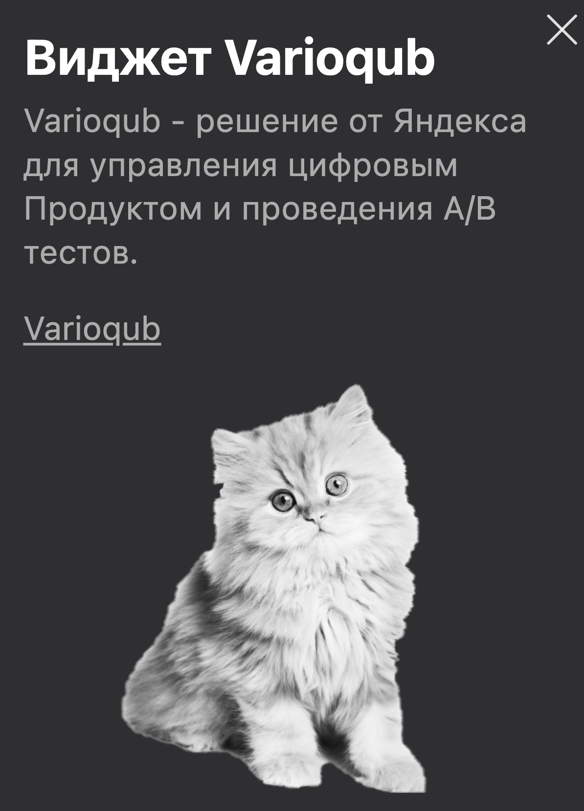
To add an image after the main text in a corner banner widget ("Баннер в углу"), use the CSS sample below. You can implement this by using pseudo-element
::after, class.ymab-integration-popup-body.Code:
.ymab-integration-popup-body::after { content: ""; display: block; width: 135px; height: 150px; background-image: url('https://avatars.mds.yandex.net/get-lpc/1220100/7b110c0f-1d2c-4330-8dd2-ca4de3e8acb5/orig'); background-size: cover; background-position: center; margin-top: 1em; justify-self: center; }Results:
-
-
Use the Experiment testing window to visually check the widget placement on your site.
-
Click Save and run.
A small window in the corner of the page. It doesn't obstruct the main content and is suitable for any website layout. Unlike corner banners, which are only available in the extended version, it doesn't allow changing the style, distance from the edge of the page, and the z-index property value.
Example of a corner banner with limited options
-
If you want to test several variants of text or design, click Add variant. This will add another variant for you to set up within your experiment. The variants will change during the experiment.
-
For each variant, select a widget type from the drop-down list.
-
Specify the settings:
-
Положение (Position): The widget's position on the site page. Available options: Top left, Top right, Bottom left, and Bottom right.
-
Цветовая тема (Color scheme): Type of color scheme to use in the widget (dark or light). Choose according to your website's overall color scheme.
-
Заголовок (Title): The widget's title text. The title is displayed in a larger font compared to other widget elements. Its size can be configured only in the extended version of Varioqub.
-
Text: Main text of the widget that is positioned below the title and explains the widget's purpose.
-
Название ссылки (Link name): The text of the link that takes users to another page when clicked.
-
Адрес ссылки (Link address): The URL of the page to open when users click the link.
-
Таймаут повторного показа после закрытия (дни) (Replay timeout after closing (days)): Number of days after which the widget may reappear after the user closes it.
-
-
Use the Experiment testing window to visually check the widget placement on your site.
-
Click Save and run.
Note
Only available in the Varioqub extended version.
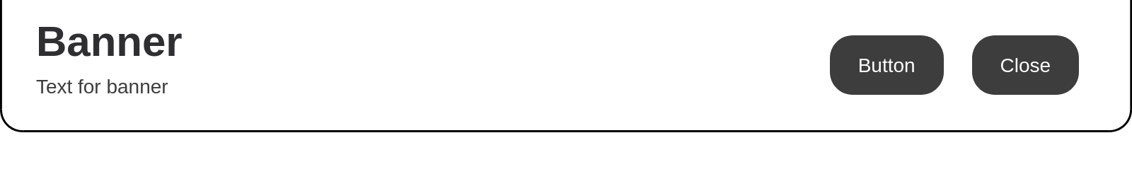
An animated pop-up window. You can place it either at the top or bottom of the screen. To draw the user's attention to the button, use the Пульсирование (Pulse) effect.
Example of a full-width banner
-
If you want to test several variants of text or design, click Add variant. This will add another variant for you to set up within your experiment. The variants will change during the experiment.
-
For each variant, select a widget type from the drop-down list.
-
Specify the settings:
-
Положение (Position): The widget's position on the site page. Available options: Сверху экрана (Top), Снизу экрана (Bottom).
-
Цветовая тема (Color scheme): Type of color scheme to use in the widget (dark or light). Choose according to your website's overall color scheme.
-
Заголовок (Title): The widget's title text. By default, the title is displayed in a larger font compared to other widget elements. To adjust its size, use Manual styles setup.
-
Text: Main text of the widget that is positioned below the title and explains the widget's purpose.
-
Название ссылки (Link name): The text of the link that takes users to another page when clicked.
-
Адрес ссылки (Link address): The URL of the page that users will land on after clicking the button.
-
Эффект кнопки для привлечения внимания (Button effect for attracting attention): Animation for the link button. Available options: Без эффекта (No effect), Пульсирование (Pulse).
-
Скорость анимации (Animation speed): The speed of the widget appearance animation. Available options: Быстрая (Fast), Средняя (Average), Медленная (Slow), and Без анимации (No animation).
-
Таймер показа баннера (секунды) (Banner display timer (seconds)): The number of seconds to wait after loading the page before the widget appears.
-
Таймаут повторного показа после закрытия (дни) (Replay timeout after closing (days)): Number of days after which the widget may reappear after the user closes it.
-
Значение CSS свойства z-index (CSS z-index property value): The widget's position on the page relative to other markup layers.
If any markup elements on the page have their own
z-indexproperty that is greater than the widget's default value, the widget will appear under those elements. In this case, increase the widget'sz-indexvalue to bring it to the front. -
Ручная настройка стилей (Manual styles setup): With manual setup, you can customize the widget to match the style of your site. This way, the widget won't stand out and will blend seamlessly with the overall design of the page.
Alert
You can edit styles only using the CSS classes listed below. Changes to other styles may alter the appearance of the entire page. You need to be familiar with CSS to edit these settings.
CSS classes available for editing
.ymab-integration-banner-body: Styles for the banner's size and initial position relative to the page..ymab-integration-banner-body-visible: Styles for the banner's position relative to the page after its appearance..ymab-integration-banner-main: Main styles for the banner's contents..ymab-integration-banner-text-block: Shared styles for the banner's text block (title and text below the title)..ymab-integration-banner-title: Styles for the title..ymab-integration-banner-text: Styles for the text below the title..ymab-integration-banner-button-block: Shared styles for the banner's button block (link button and Close button)..ymab-integration-banner-button-link: Styles for the link button..ymab-integration-banner-close: Styles for the Close button.
Example: Adding an image using CSS
To add an image after the main text in a full-width banner widget ("Баннер на ширину экрана"), use the CSS sample below. You can implement this by using pseudo-element
::after, class.ymab-integration-banner-title.Code:
.ymab-integration-banner-title::after { content: ""; display: block; width: 70px; height: 80px; position: absolute; right: 0; top: 0; background-image: url('https://avatars.mds.yandex.net/get-lpc/1220100/7b110c0f-1d2c-4330-8dd2-ca4de3e8acb5/orig'); background-size: cover; background-position: center; justify-self: center; } .ymab-integration-banner-text-block{ position: relative; }Results:

-
-
Use the Experiment testing window to visually check the widget placement on your site.
-
Click Save and run.
Note
Only available in the Varioqub extended version.
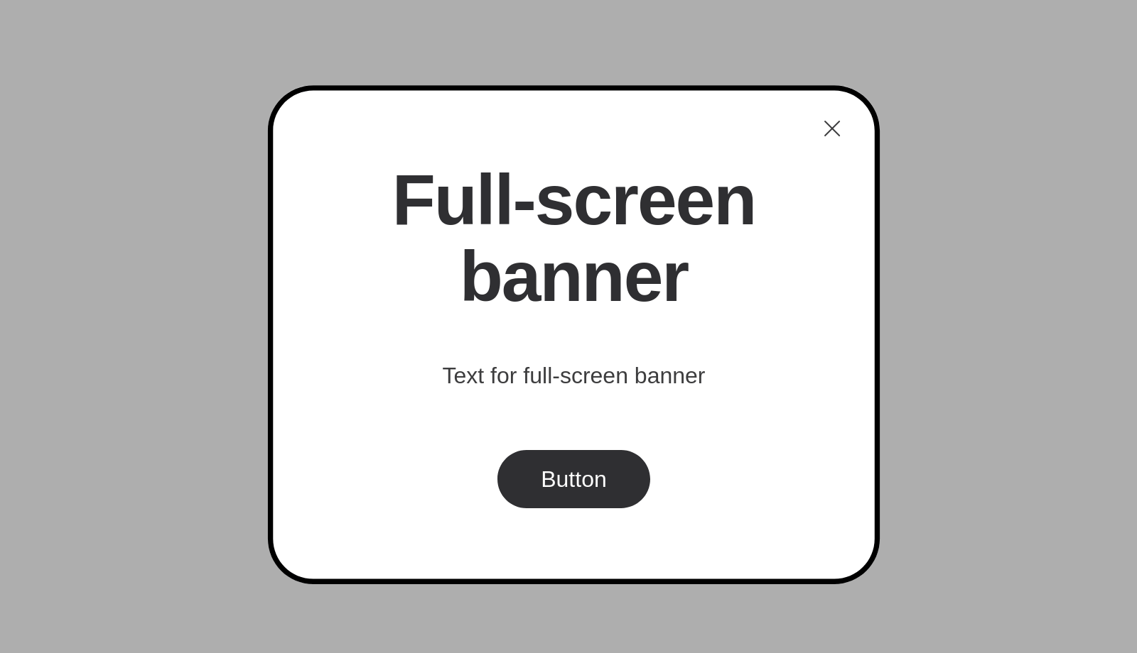
The most prominent widget, covering the entire site page. Users will definitely notice this banner and have to either click on the link or close the window.
Example of a fullscreen banner
-
If you want to test several variants of text or design, click Add variant. This will add another variant for you to set up within your experiment. The variants will change during the experiment.
-
For each variant, select a widget type from the drop-down list.
-
Specify the settings:
-
Цветовая тема (Color scheme): Type of color scheme to use in the widget (dark or light). Choose according to your website's overall color scheme.
-
Заголовок (Title): The widget's title text. By default, the title is displayed in a larger font compared to other widget elements. To adjust its size, use Manual styles setup.
-
Text: Main text of the widget that is positioned below the title and explains the widget's purpose.
-
Название ссылки (Link name): The text of the link that takes users to another page when clicked.
-
Адрес ссылки (Link address): The URL of the page that users will land on after clicking the button.
-
Скорость анимации (Animation speed): The speed of the widget appearance animation. Available options: Быстрая (Fast), Средняя (Average), Медленная (Slow), and Без анимации (No animation).
-
Таймаут повторного показа после закрытия (дни) (Replay timeout after closing (days)): Number of days after which the widget may reappear after the user closes it.
-
Значение CSS свойства z-index (CSS z-index property value): The widget's position on the page relative to other markup layers.
If any markup elements on the page have their own
z-indexproperty that is greater than the widget's default value, the widget will appear under those elements. In this case, increase the widget'sz-indexvalue to bring it to the front. -
Ручная настройка стилей (Manual styles setup): With manual setup, you can customize the widget to match the style of your site. This way, the widget won't stand out and will blend seamlessly with the overall design of the page.
Alert
You can edit styles only using the CSS classes listed below. Changes to other styles may alter the appearance of the entire page. You need to be familiar with CSS to edit these settings.
CSS classes available for editing
.ymab-integration-fullscreen-body: Styles for the fullscreen widget's size and initial position relative to the page..ymab-integration-fullscreen-main: Main styles for the fullscreen widget's contents..ymab-integration-fullscreen-main-visible: Styles for the fullscreen widget's position relative to the page after its appearance..ymab-integration-fullscreen-close: Styles for the × (Close) button..ymab-integration-fullscreen-block: Shared styles for the banner's text block (title and text below the title) and the link button..ymab-integration-fullscreen-title: Styles for the title..ymab-integration-fullscreen-text: Styles for the text below the title..ymab-integration-fullscreen-button-link: Styles for the link button.
Example: Adding an image using CSS
To add an image after the main text in a fullscreen banner widget ("Баннер на всю страницу"), use the CSS sample below. You can implement this by using pseudo-element
::after, class.ymab-integration-fullscreen-text.Code:
.ymab-integration-fullscreen-text::after { content: ""; display: block; width: 110px; height: 120px; background-image: url('https://avatars.mds.yandex.net/get-lpc/1220100/7b110c0f-1d2c-4330-8dd2-ca4de3e8acb5/orig'); background-size: cover; background-position: center; margin-top: 1em; justify-self: center; }Results:
-
-
Use the Experiment testing window to visually check the widget placement on your site.
-
Click Save and run.
FAQ and troubleshooting
I'm trying to create an experiment, but all the fields are locked.
What if I want to use conditions that are not available in the Varioqub interface?
How do I disable a specific experiment type for an entire site or page?